
Visualizing Illinois State Board of Education Report Card data (2016)
An interactive map allows users to explore Illinois Education data at a high level.

The Interactive Version:
Click this link to just jump to the tool and play around with data.
About this Tool
Awhile back I was very interested in Illinois educational data. My wife and I had just moved back to Central Illinois. Presently (2023) we have 3 girls, although at the time we had just 2. My oldest daughter was turning 5, about to enter Kindergarten. And we’re trying to make a decision on where to live, which inevitably invovles assessments about the school districts. So I set about learning about the various school districts. The first site significant site I came across was the Illinois State Board of Education. They have a great tool called the Illinois State Report Card. I spent hours on it. However, I felt like it was missing one key thing. This was the ability to compare various districts against one another at a glance.
So I dove into the data and started pulling the raw files. v I wrote scripts to summarize the data. I then combined it with geographic schools district boundaries (geojsons). Lastly, I enlisted the help of a web designer Brandon D’Adams who helped me with the deployment and design of the tool site. The end result is this interactive tool.
Warning! This information is from 2016
Yes this post is very dated. As of this writing of this blog posts it’s 2023. However, I feel it’s better to share than not share as was a pretty involved data exploration project and I hate to see it sit all alone in my GitHub repository. Better for it to be shared with the world (even if dated).
Insights
Here’s a few screenshots of the data I found most interesting.
Classroom Size
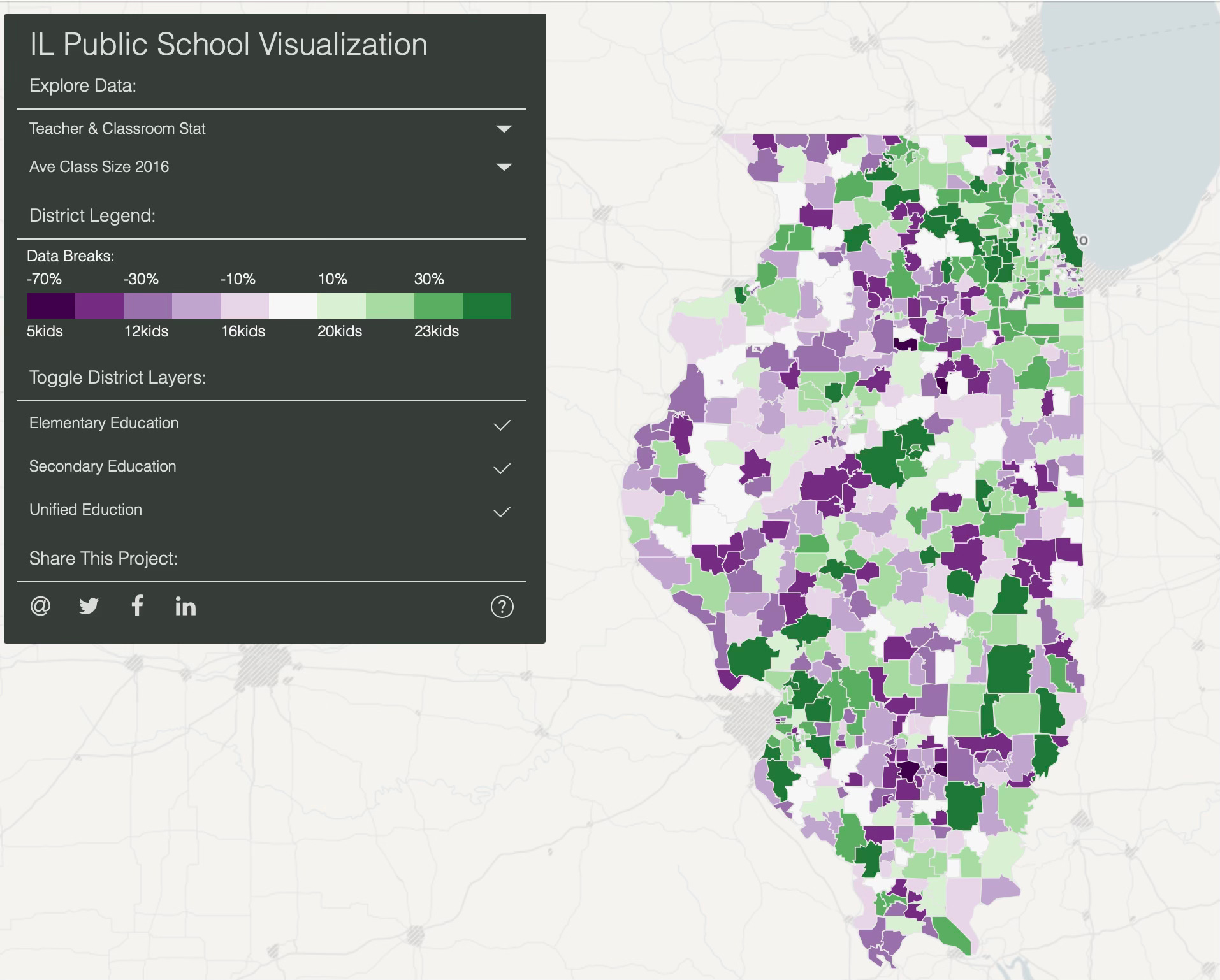
Some obvious clusters of larger classroom sizes in green around Chicago and St. Louis.
Teacher Salary
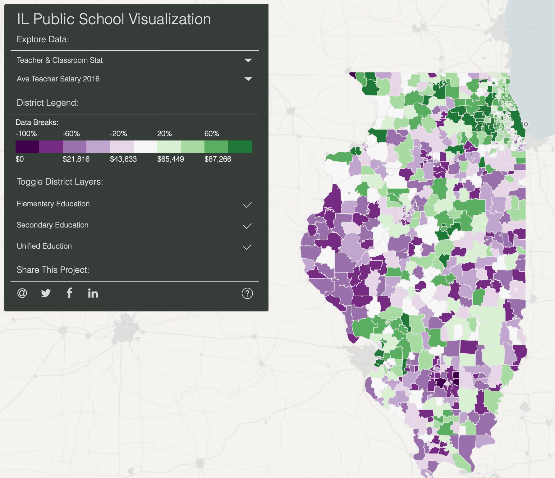
Teacher salaries are notably higher (green) in and around Chicago and St. Louis suburbs. Feel free to explore the tool and hover over individual school districts to see more data about a particular district.
Percent Ready for College
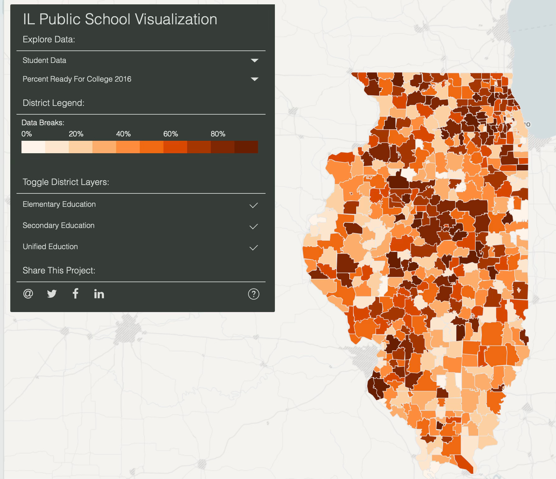
This indicates the percentage of studies ready for college. Darker orange means more student prepared, lighter orange means fewer.
Percentage of Student that are Homeless
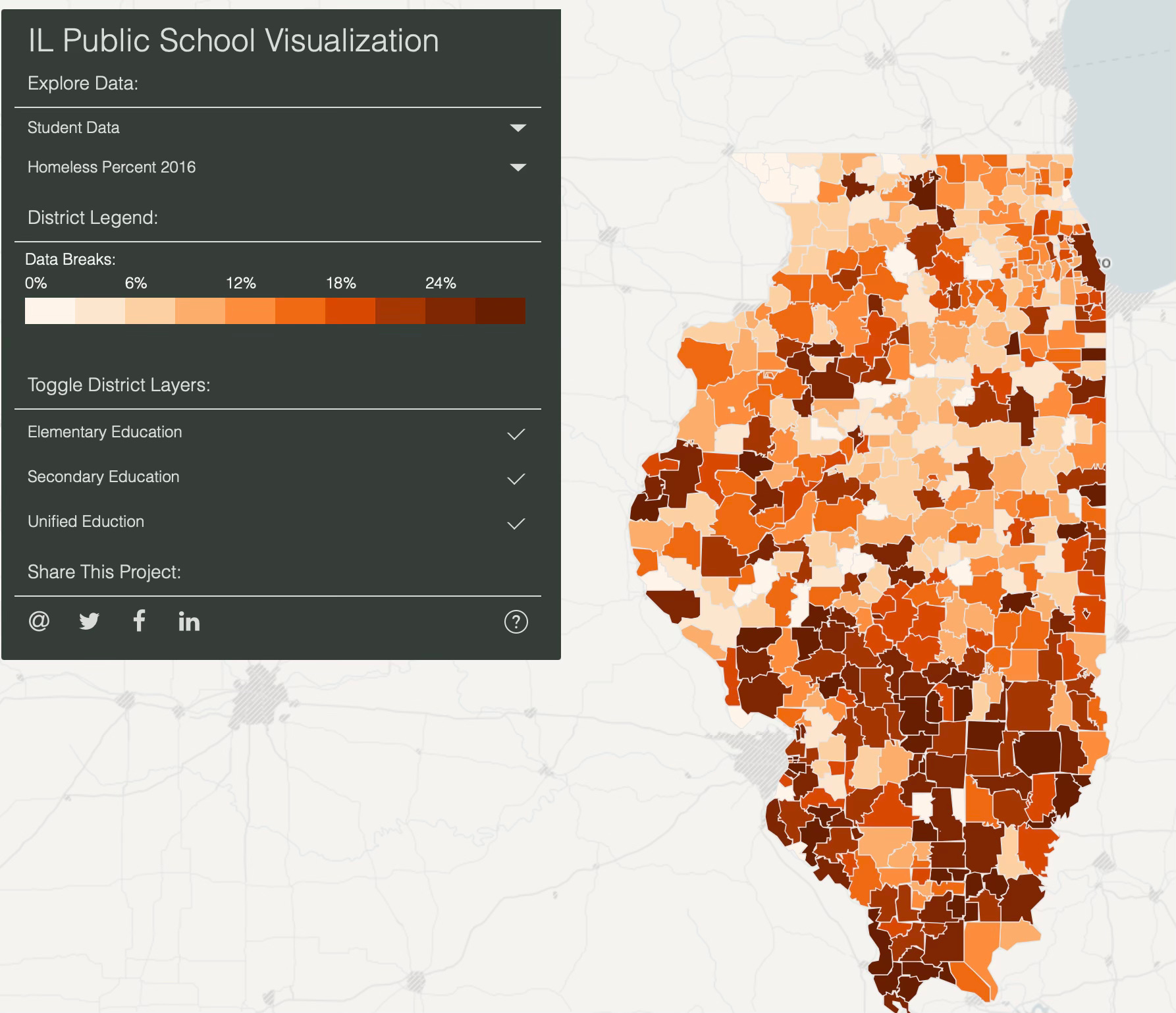
This map was perhaps the most heartbreaking. I was shocked at many school districts having upwards of 7% of students are unhoused! That means in a school of 200 there could be 7-8 students unhoused (or even 14 in some districts). I can only imagine how difficult it must be for a children to excel in education while without housing.
Correction / Error. The “Legend” here is labels the color legend from 0% to 24% (this is wrong). It should read 0% to 7%.
Operational Expenditure Per Pupil (OEPP)
This metric measures the overall operational expenditure in each district per student. Higher amounts spent per pupil in Green, lower amounts in purple.
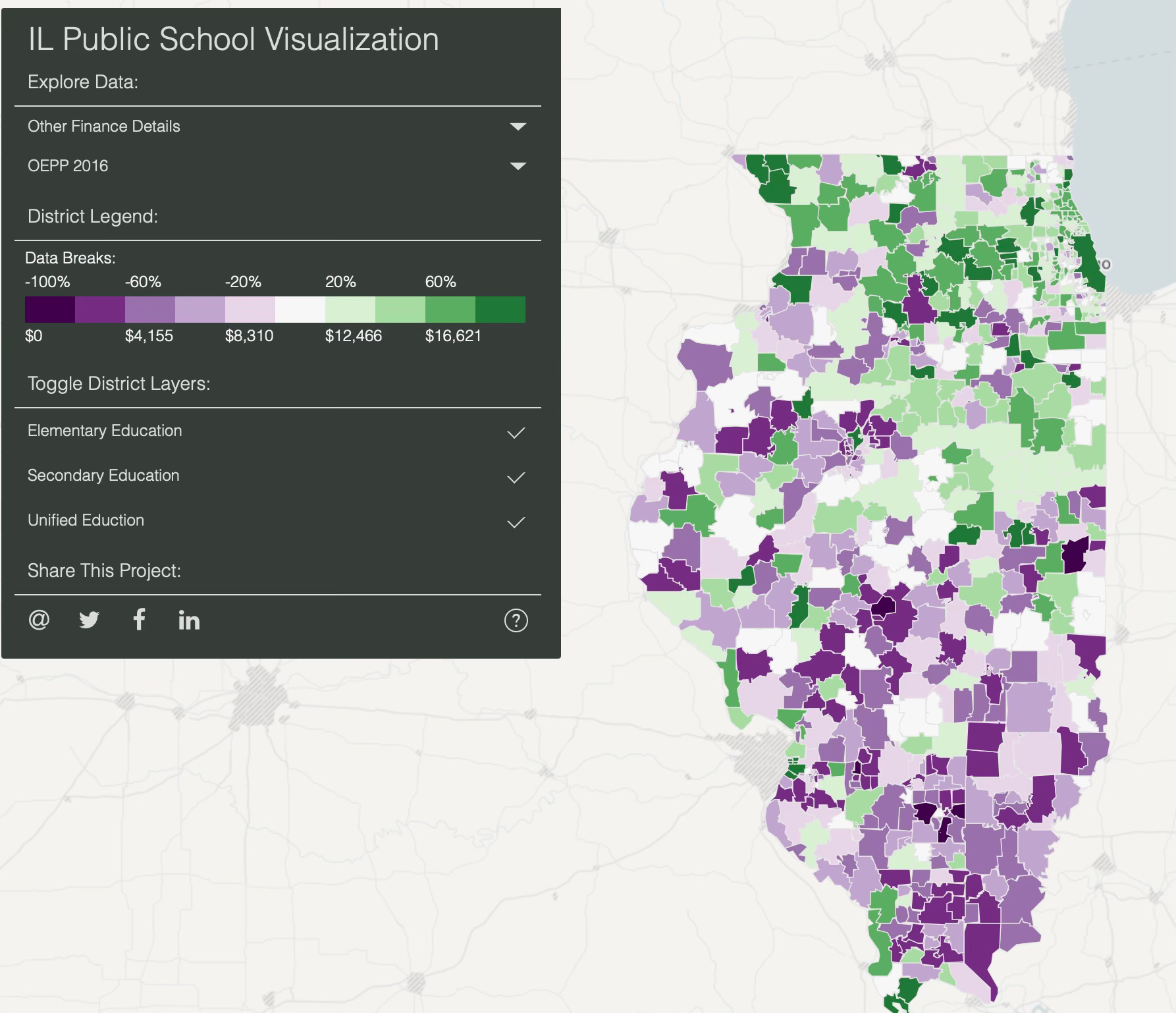
An obvious bias of expenditure toward the northern part of the state. I am curious of the correlation between expenditure per student and student performance. To what degree does spending more achieve higher results? Of course, correlation doesn’t mean causation. My sense is there is a lot going on here. I’m sure there are people who spend their careers studying these questions of optimal expenditure. However, my sense is that school district operation expenditure per student is closer related to local funding source (i.e. local property taxes). It makes me wonder if states that rely more on local school district funding have a wider range of student performance. My guess is they would. My thinking is this would be due to the fact that with more local funding there would be certain districts with higher property taxes who are able to contribute more to their local schools, resulting in a “haves and have not” situation. It would be interesting to compare against states like Minnesota and Massachusetts that relay more on State funding sources. I have read articles that this can result in a ‘flatter’ amount of spending per student across the state, which I would think results in less disparate outcomes. Comment if you know of any such research or if you have thoughts of your own.
Conclusion
This project is meant to experiment with mapping tools and to use chrolopleth to visualize data in new ways. Perhaps future posts will …
Refresh the data to more recent info (2023)
Explore correlations between funding and performance
Add time elements to visualize changes over time.
Connect education / researches studying the effect of Local vs State funding sources.
Sources
Those interested in exploring the code…
Here is a link to my GitHub account for the data processing portion of the code
Here is a link to my GitHub account for the website build (Thanks again Brandon!)
Primary data comes from Illinois State Board of Education Report Card. https://www.illinoisreportcard.com
Attributions
A special thanks to Brandon D’Adams who did much of the heavy lifting on the website and design elements of the interactive data visualization.