
Emissions of Particular Matter less than 2.5 micrograms (PM2.5) Analyzed
A project in R analyze PM 2.5 Emissions data

The information below is an assessment of Particulate Matter that is less than 2.5 micrograms. For full disclosure, this project was done as a sort of ‘portfolio piece’ to illustrate data science skills for a potential employer. Alas, I didn’t end up going with the employer in question, but after the question was posed I ended up completing this piece. The question was primarily designed to be a ‘conversation starter’ to assess how you might think about a problem, but I was interested in seeing if I could just illustrate what / how I would approach the problem. So I just decided to do an analysis. Even though I didn’t end up working with them, I believe it’s safe to say I exceeded their expectation on this front. I doubt the employer would mind me sharing since it was 5 plus years ago and I believe they are now asking different questions. Plus this data was last updated using 2014 data emissions.
The source of the information is largely the U.S. Environmental Protection Agency, although it’s supplemented with The U.S. Department of Transportation and US Department of Agriculture. For the full code in R along with a PDF of the final representation please see my GitHub account here.
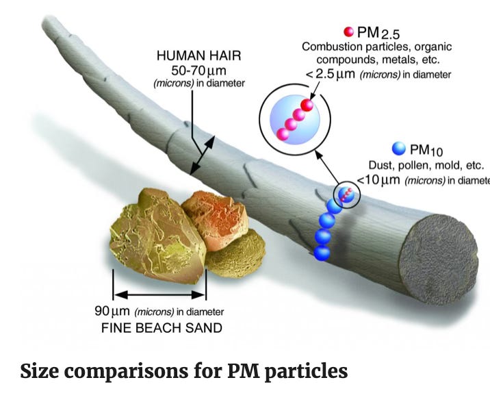
For sake of Definitions sake, Particulate Matter of less then 2.5 micrograms a (aka PM2.5) is described as fine inhalable particles, with diameters that are generally 2.5 micrometers and smaller. For more information on PM2.5, what they are and why they are dangerous see this link from the US EPA. The EPA regulates particulate that are inhalable (defined as 10 micrograms or smaller). It does not regulate particles larger particulates of 10 micrograms or larger. Here is a picture from EPA’s website to illustrate the relative size of the particles.
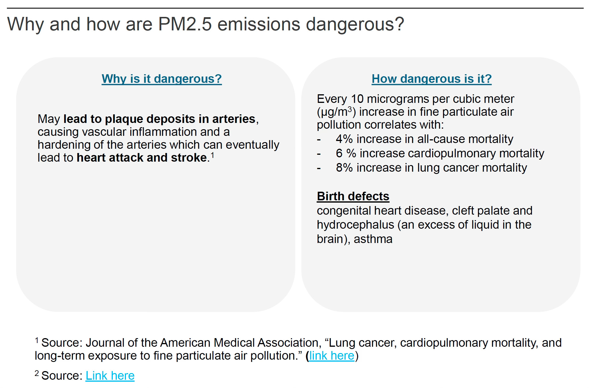
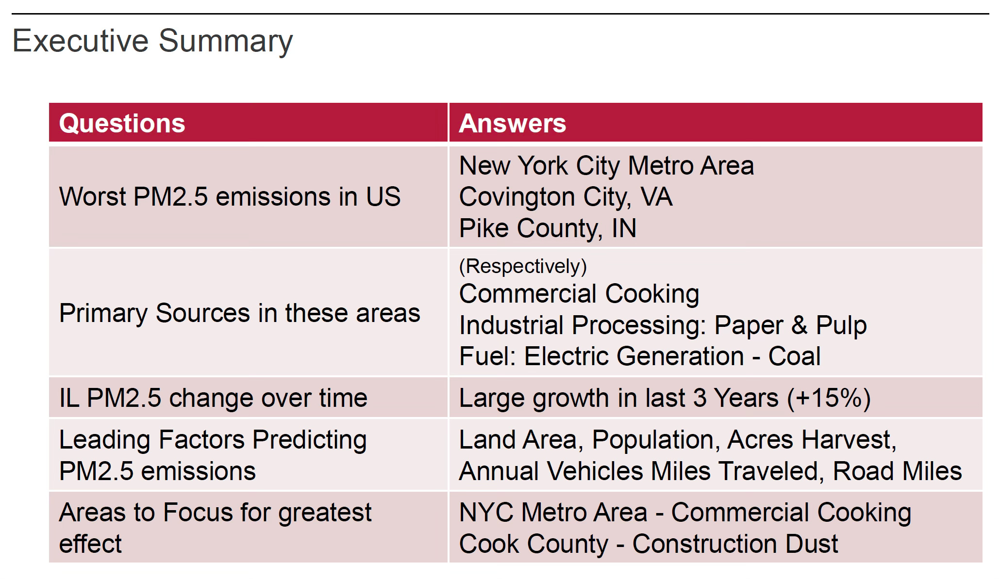
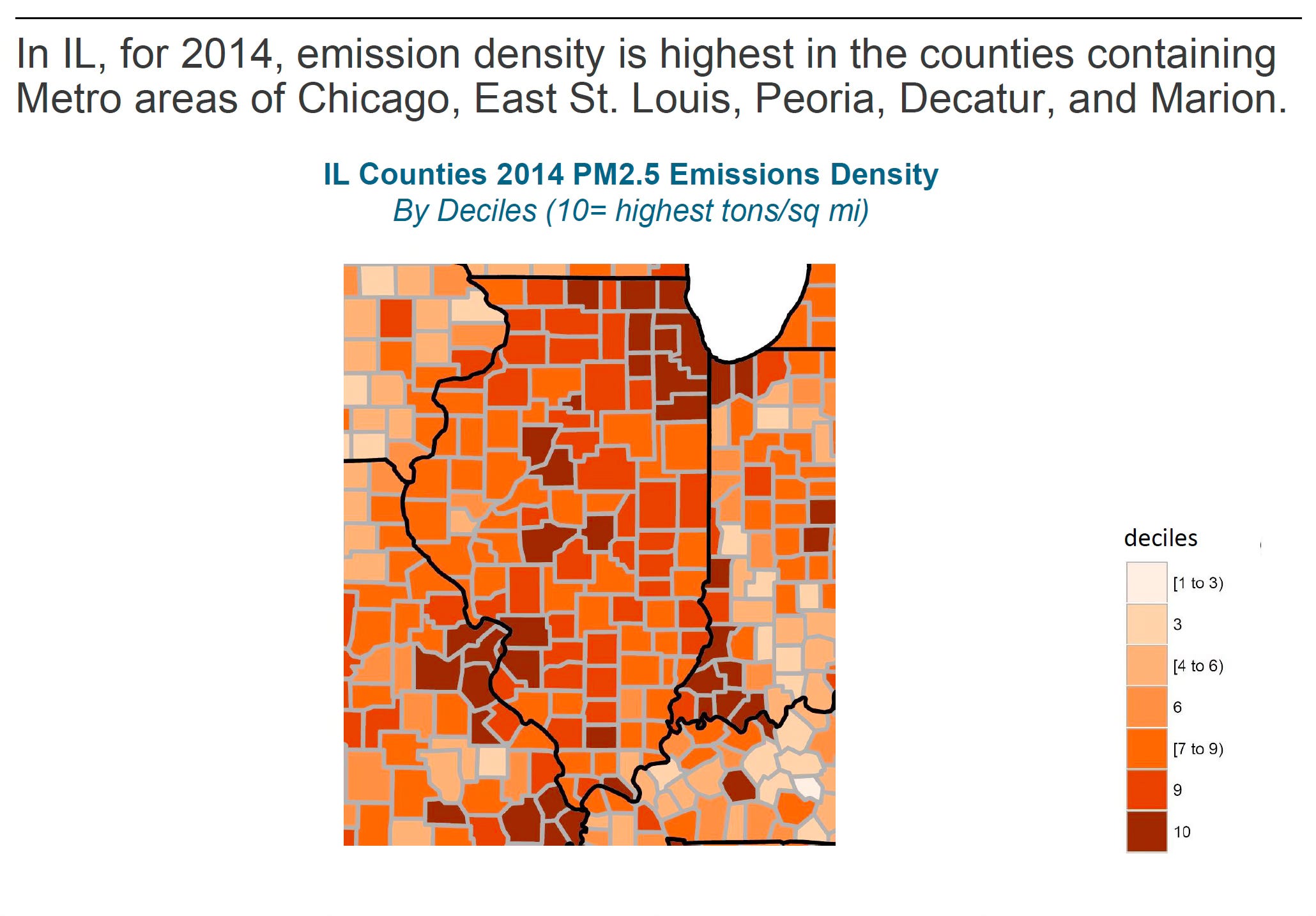
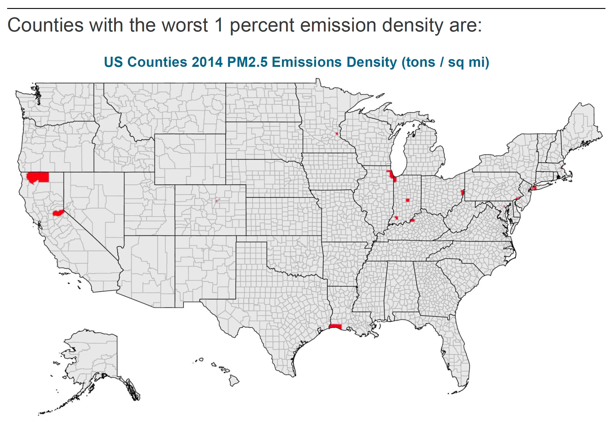
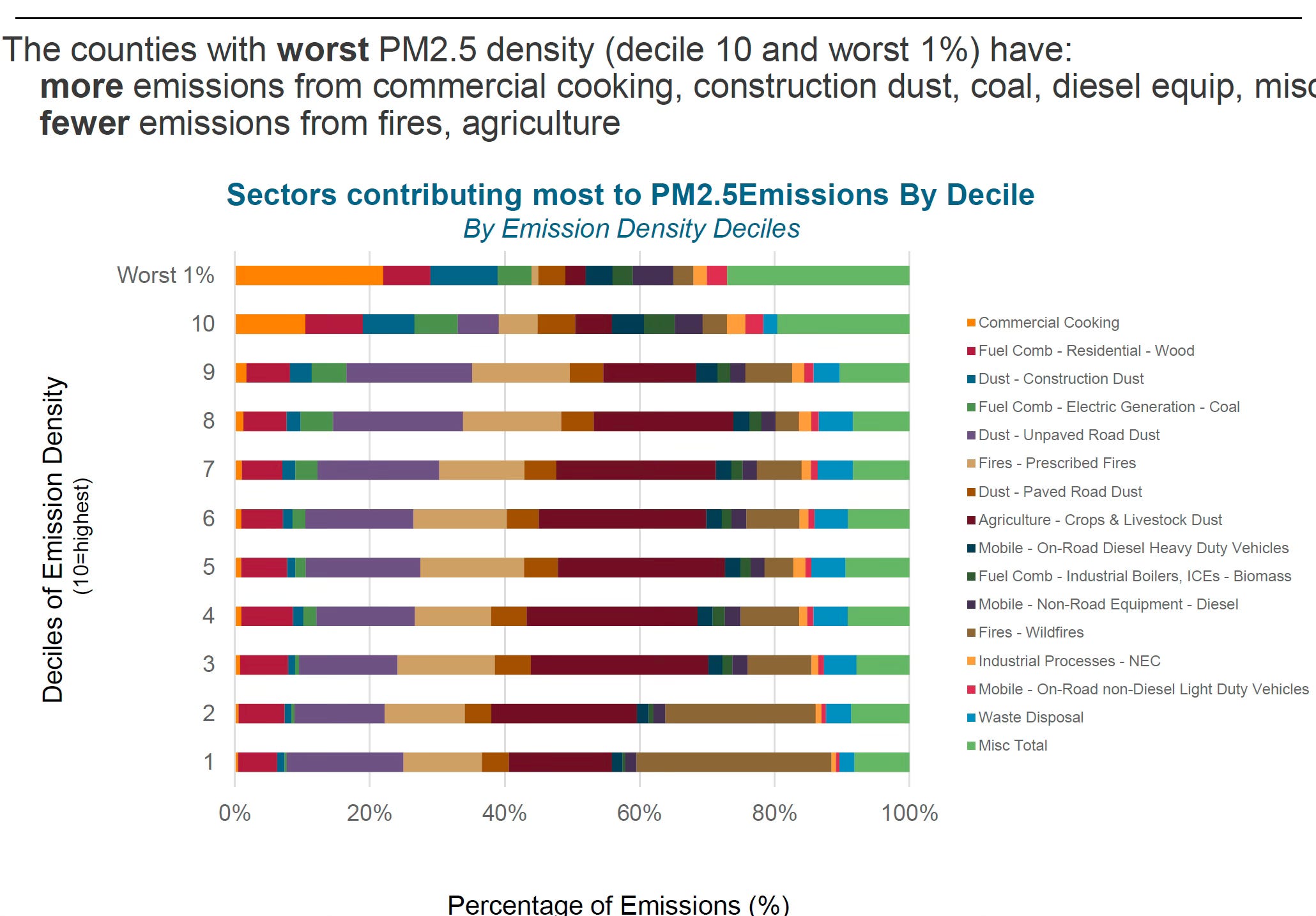
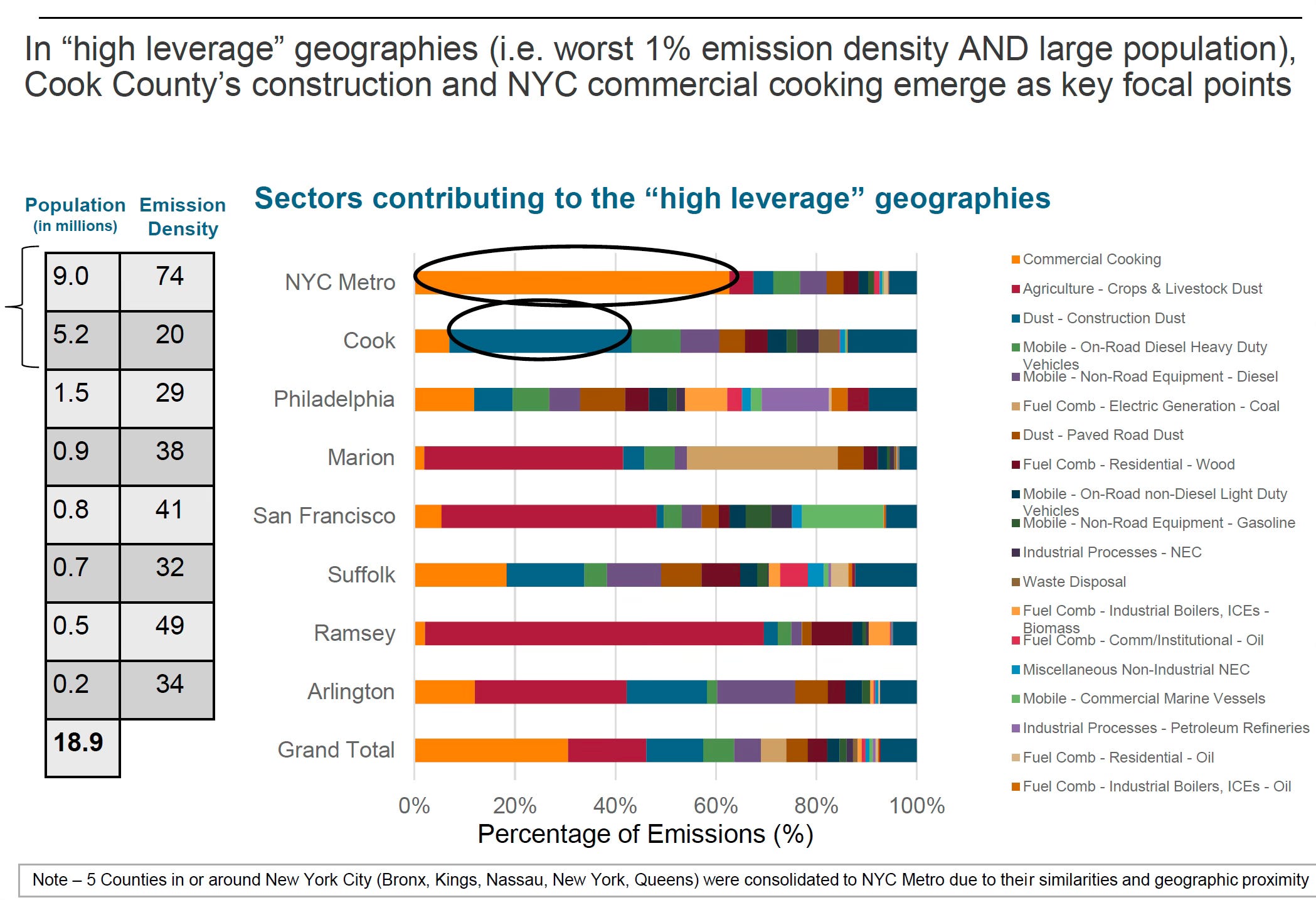
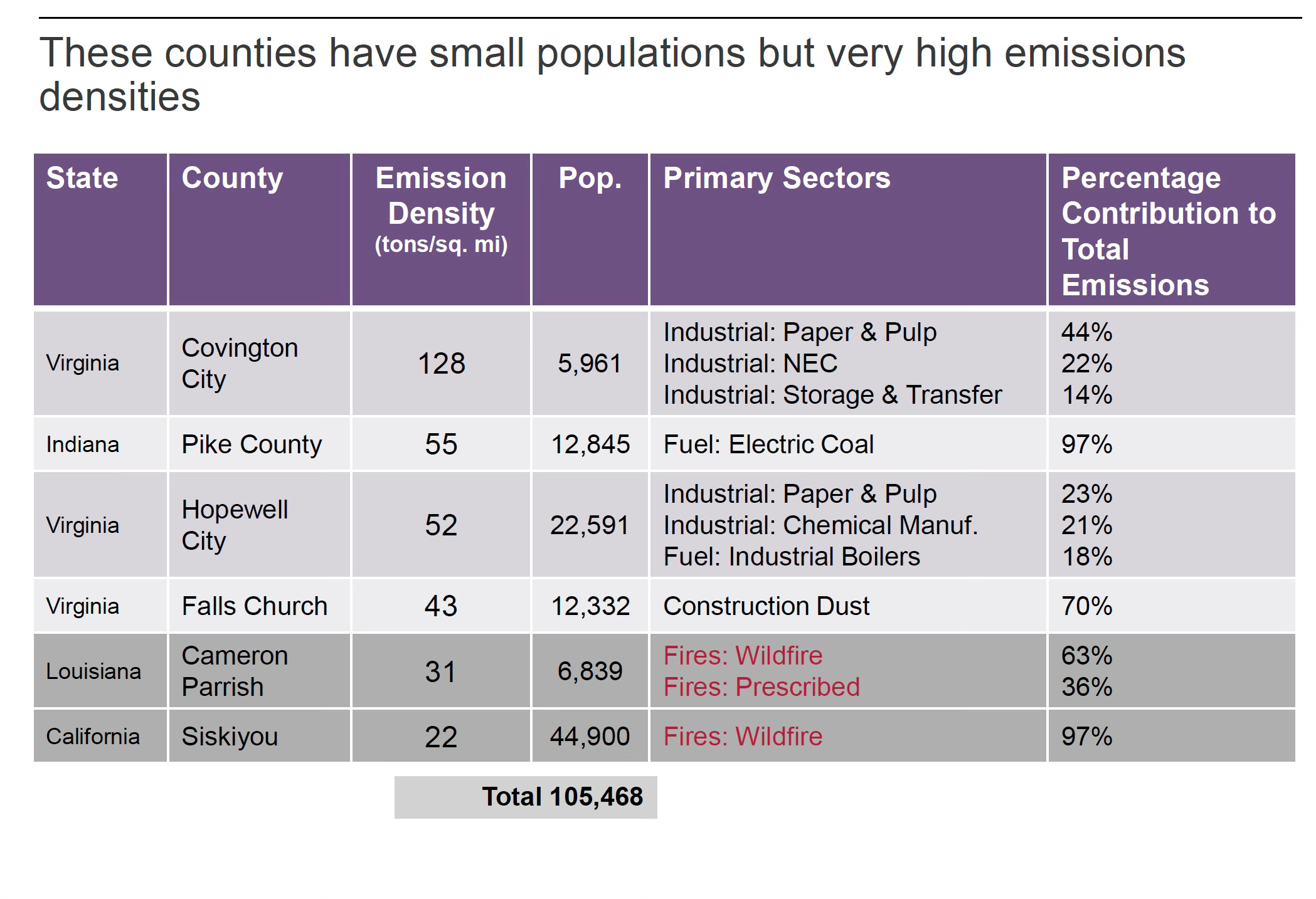
The remaining content is in screenshots from my original powerpoint. Apologies, in advance for the “slide show” format. While not for everyone, hopefully it’s a bit more visual. I suppose I haven’t completely kicked my addiction to slides from my ‘consultant’ days.
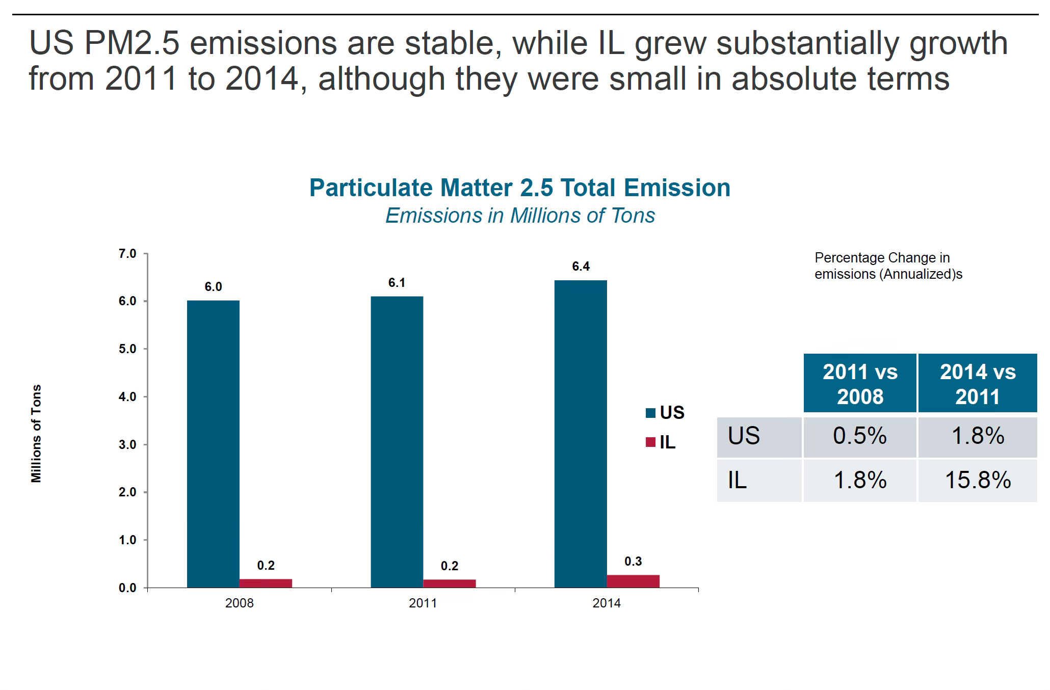
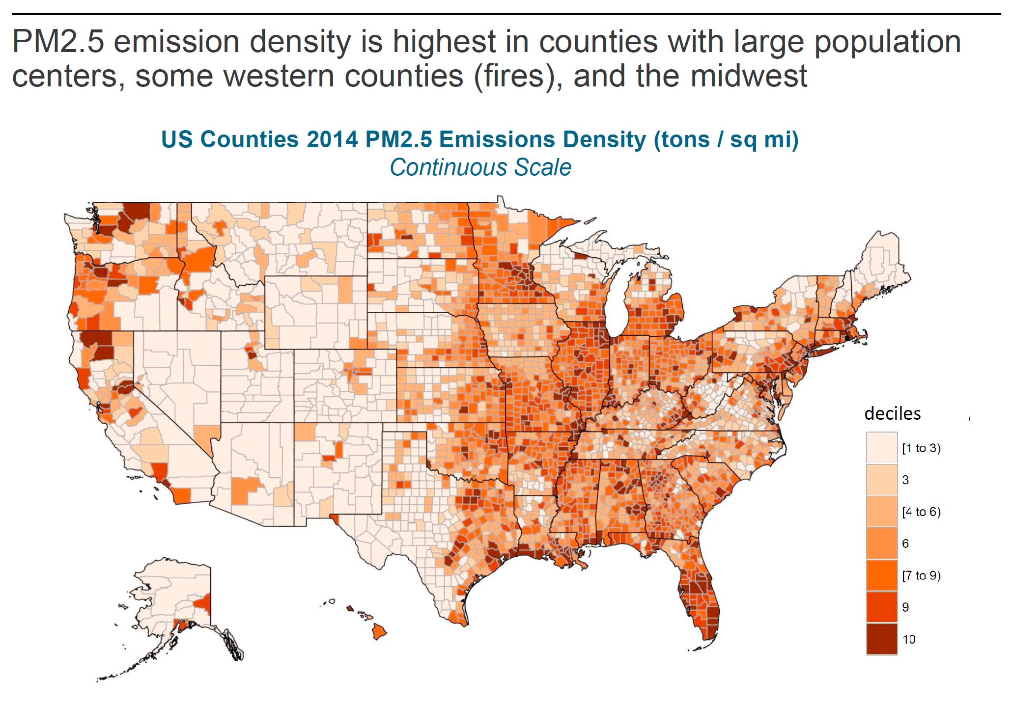
Future Blog posts could update this information to more recent data sets and assess the change over time. Data from the EPA at this site indicate an overall downward trend in PM2.5 however it would be interesting to see if the same worst offending US counties are still on the same list. Additionally, wildfires are a large contributor to PM2.5 emissions, they are likely to have increased since 2014 to cause more severe density especially in the west.
Feel free to like and/or comment on interesting things you see in the data.